
9280 S. Kyrene Rd.
Suite 134
Tempe, AZ 85284
Phone: +1 (888) 284-5197
Email: contact@handwrytten.com


You have been subscribed. Thank you!
In 2001, a Victorian-era sold at auction for £22,000. That’s about $35,000! The handwritten and hand-painted lithograph may be the first ever commissioned. It’s over 160 years old!
In the United States, are big. The U.S. Post Office estimates Americans send 6.5 billion festive cards every year. As a business owner, it makes sense to want your cards to stand out.
Discover the best ideas for your business this year. These concepts innovate in terms of design, message, and overall style.
Keep readings for .
There are plenty of ideas your business can steal for cards. Ideas for company cards fall into three categories: design, message, and style. Let’s kick things off with design.
Design is the first element that can push your creativity. When you develop a creative design, there are plenty of factors to consider.
You can develop surprising concepts for the ‘s shape, style, size, color, and message. You might try to implement your existing business themes. Get started with the following ideas for your .
Customizing your brand’s logo can make for a unique . There are two main approaches to logos.
One option is to “dress up” your company logo. That is, find a designer who can cover the logo in , or transform it into a reindeer. But, keep the logo recognizable.
Another option is to keep the logo the same, but blend it into the design. Create a repeating pattern with your logo, then use it as the cards’ background.
Intersperse the pattern with symbols. Or, use a festive color palette to make the logo -appropriate.
A shows the people behind your brand. To make a creative photo , consider a fun option. Choose a design that lets you superimpose photos of people’s faces into drawings of Santa, elves, or snowmen.
You might also choose an asymmetrical, yet balanced composition. In these cards, multiple photos are arranged on a single . The photos are “framed” by the design, which emphasizes different-sized images.
It’s hard to go wrong with an in-set photo. Yet, an off-center design can also work. In this kind of image, the photo “spills” over the page’s edge, while the design fills in about half the canvas.
cards come in two popular shapes. The first is the A2 folded . The second is the flat A7 . Learn about these classic sizes on this page.
Some businesses choose smaller or larger cards to stand out. If you want to print cards larger than 8.5″ x 5.5″, you might need to seek out custom options.
Die-cut shapes outline fun images. The top of the is shaped like a pine tree landscape or reindeer antlers, rather than staying flat.
The downside is, quirky shapes can be challenging in bulk. Avoid designs that might tear or bend easily in the mail.
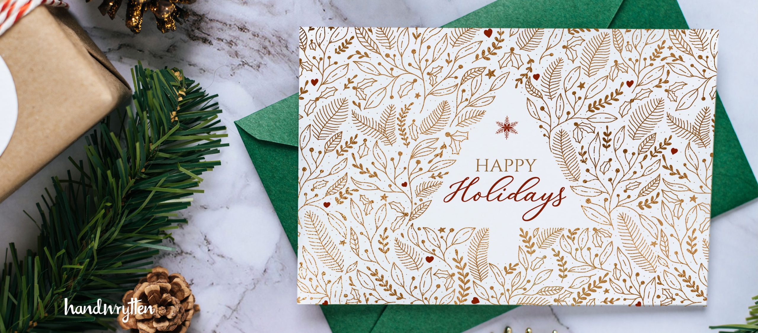
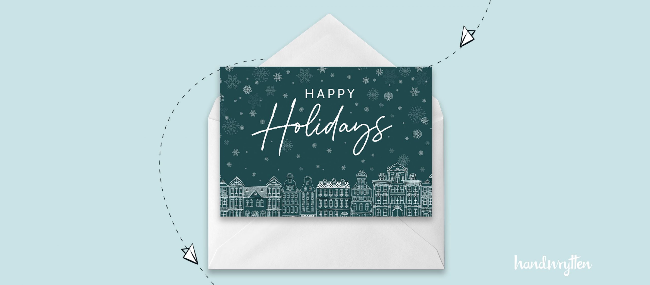
Stand out with a unique color palette. Here are some unique color options for cards.
Consider analogous colors, with one “pop” of the opposite color. Color theorists call this opposite color the “complementary color.”
An example of this palette might be a night-time winter scene rendered in blues. Then, there’s a pop of vivid orange, from a campfire.
Or, imagine a single cluster of red holly berries among a mix of greens. That’s an analogous-opposite palette.
Similarly, another classic motif is black + white + one color. You might choose your company’s brand color. To twist the theme slightly, create a full greyscale color palette, then add one color.
This color scheme is on-trend for Spring 2022. Use it in a to show your taste.
In essence, this is a primary color palette with a playful hue. That is, it includes cyan, yellow, and magenta, and black (as a key tone). Or, it uses red, yellow, and blue, plus a white key tone.
This trend is very bright! Some designers filter it through a softening color, very faintly. It can make any fun and exciting.
Fashion prediction for clothes and cards alike: cocoa and mulberry palettes.
Color-based browns use blends of reddish-orange and deep blue. They feel warm, cozy, and natural. Think of deer or hot cocoa.
The mulberry, plum, or honey golden-orange tone on the palette makes it work. This color stays analogous while drawing out the colorful base of the chosen brown shades.
Style and motif choices can really set a apart. Explore these creative styles and aesthetic ideas.
Many businesses choose formal fonts. These fonts emphasize classic aesthetics and readability. In professional settings, serif fonts are making a comeback. Think “retro Times New Roman,” but with a bit of a modern twist.
A font can convey tone by evoking a known object. It may be designed to look like Roman pillars, trees, balloons, brickwork, or even grooves on a record.
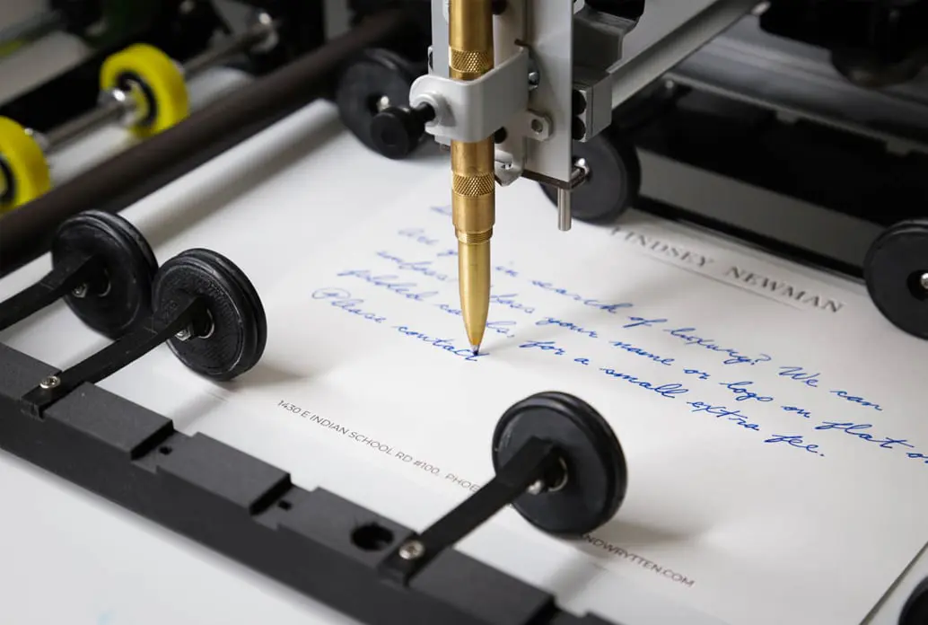
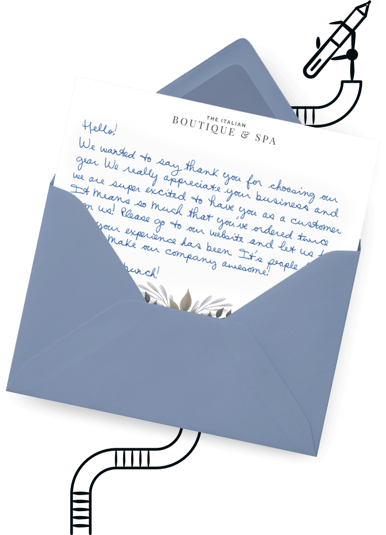
Fonts with flourishes might imply romance or whimsy. Handwritten fonts can feel personal and thoughtful. Integrating handwritten fonts, or actual handwriting, into a front-of- design gives recipients a pleasant surprise.
On a , the imagery might be a scene, an icon (a single image, like a wreath), or text stylized as a graphic.
You might even use an illustrative pie chart or graph in a whimsical way. Some clever cards show “facts” about the percentage of songs you remember, or trends in Santa’s rate of present delivery.
When it comes to style, there are a few standouts business designs. Different aesthetics evoke different moods, time periods, and cultural associations.
If you use these styles in your , you’re saying, “We’re modern and future-focused.” This youthful appeal can set your apart.
Your message can be all you. Think about memorable conversations, and what you appreciate about people. Here are some ideas to get you started.
A simple can still come from the heart. These classic messages might work for your .
For more inspiration, check out suggestions compiled by influencers. Instagram and Pinterest offer troves of inspiration.
Poetry and proverbs can elevate your ‘s beauty. Think about lines or stanzas from pieces in the public domain.
For English-language classics, take inspiration from Walt Whitman’s poem “Sounds of Winter.” Or, take a stanza from “Silver Bells” by Edgar Allen Poe.
And, of course, the poem “Holidays” by Henry Wadsworth Longfellow taps into the most wonderful parts of the spirit.
Your could also include poetry about hope, liberty, community, or other values. Emma Lazarus’ poem “The Great Colossus” is iconic.
Not into poetry? Try a joke!
There are many funny options for your . Why not write:
You could also turn a meme into a . Take a funny animal photo meme. Then, put the funny photo on the front of the , and write the caption on the inside.
This year has been a challenge for everyone. If you want to encourage your employees, try a few of these ‘s greetings:
People feel touched when they receive personalized cards. Today, you can create personalized, custom cards in bulk.
Create a spreadsheet with a row for each recipient. In the row, write notes on each person. Make sure to highlight their achievements or positive attributes.
With -writing technology, you can import these notes into a template message. This lets you recognize each unique recipient with a , without writing out hundreds of cards.
Save time while staying creative! Handywritten lets you upload custom designs and messages. It’s never been easier to send cards online.
Handywritten uses automation, so you won’t forget anyone on your list. And, online cards don’t have to be generic! Take the time to personalize cards for each client and employee – without writing every note yourself.
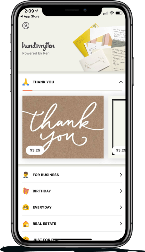
At Handywritten, we work with a range of creative ideas. With our custom creator tool, you can design unique cards at a time that works best for you. Select pre-created designs, explore customizations, or upload your own designs. Create a free account to take your cards to the next level today!

Scale your handwritten outreach, creating positive impressions and long lasting bond.
Sign Up Today!

Over 100 designs to choose from or design your own. Our online card customizer makes it simple.
Check Out Our Cards!


Thank you.
